Custom card
Dashboards are our approach to defining your user interface for Home Assistant. We offer a lot of built-in cards, but you're not just limited to the ones that we decided to include in Home Assistant. You can build and use your own!
Defining your card
This is a basic example to show what's possible.
Create a new file in your Home Assistant config dir as <config>/www/content-card-example.js and put in the following contents:
class ContentCardExample extends HTMLElement {
  // card is connected to the DOM
  connectedCallback() {
    const event = new CustomEvent('context-request', {
      bubbles: true,
      composed: true,
      cancelable: true,
    });

    event.context = 'states'; // the key HA's user context provider uses
    event.subscribe = true; // subscribe to future updates of this context, not just get the current value

    event.callback = this._updateStates;

    this.dispatchEvent(event);

    // initial render
    this._render();
  }

  // receive the states updates and checks if the card needs a rerender
  _updateStates = (states, unsubscribe) => {
    // Store the unsubscribe function so we can call it when the card is removed from the DOM
    this._unsubscribe = unsubscribe;

    const entityId = this.config.entity;
    console.log("update states", states, entityId)
    const state = states[entityId];
    const stateString = state ? state.state : "unavailable";
    console.log("stateString", stateString, this.stateString)
    if (this.stateString !== stateString) {
      console.log("stateString changed, re-rendering")
      this.stateString = stateString;
      this._render();
    }
  }

  // renders the html of the card, just if needed
  _render = () => {
    this.innerHTML = `
      The state of ${this.config.entity || "?"} is ${this.stateString || "unavailable"}!
      <br><br>
      <img src="http://via.placeholder.com/350x150">
    `;
  }

  // The user supplied configuration. Throw an exception and Home Assistant
  // will render an error card.
  setConfig(config) {
    if (!config.entity) {
      throw new Error("You need to define an entity");
    }
    this.config = config;
  }

  // The height of your card. Home Assistant uses this to automatically
  // distribute all cards over the available columns in masonry view
  getCardSize() {
    return 3;
  }

  // The rules for sizing your card in the grid in sections view
  getGridOptions() {
    return {
      rows: 3,
      columns: 6,
      min_rows: 3,
      max_rows: 3,
    };
  }

  disconnectedCallback() {
    if (this._unsubscribe) {
      this._unsubscribe();
      this._unsubscribe = undefined;
    }
  }
}

customElements.define("content-card-example", ContentCardExample);
Referencing your new card
In our example card we defined a card with the tag content-card-example (see last line), so our card type will be custom:content-card-example. And because you created the file in your <config>/www directory, it will be accessible in your browser via the url /local/ (if you have recently added the www folder you will need to re-start Home Assistant for files to be picked up).
Add a resource to your dashboard configuration with URL /local/content-card-example.js and type module (resource docs).
You can then use your card in your dashboard configuration:
# Example dashboard configuration
views:
  - name: Example
    cards:
      - type: "custom:content-card-example"
        entity: input_boolean.switch_tv
API
Custom cards are defined as a custom element. It's up to you to decide how to render your DOM inside your element. You can use Polymer, Angular, Preact or any other popular framework (except for React – more info on React here).
Configuration
Home Assistant will call setConfig(config) when the configuration changes (rare). If you throw an exception if the configuration is invalid, Home Assistant will render an error card to notify the user.
Data context
In the example, you see we use a custom event to request the states of Home Assistant. This is the recommended way to get data from Home Assistant, and to subscribe to future updates of this data. See a detailed documentation here.
Sizing in masonry view
Your card can define a getCardSize method that returns the size of your card as a number or a promise that will resolve to a number. A height of 1 is equivalent to 50 pixels. This will help Home Assistant distribute the cards evenly over the columns in the masonry view. A card size of 1 will be assumed if the method is not defined.
Since some elements can be lazy loaded, if you want to get the card size of another element, you should first check it is defined.
return customElements
  .whenDefined(element.localName)
  .then(() => element.getCardSize());
Sizing in sections view
You can define a getGridOptions method that returns the min, max and default number of cells your card will take in the grid if your card is used in the sections view. Each section is divided in 12 columns.
If you don't define this method, the card will take 12 columns and will ignore the rows of the grid.
A cell of the grid is defined with the following dimension:
- width: width of the section divided by 12 (approximately
30px) - height:
56px - gap between cells:
8px
The different grid options are:
rows: Default number of rows the card takes. Do not define this value if you want your card to ignore the rows of the grid (not defined by default)min_rows: Minimal number of rows the card takes (1by default)max_rows: Maximal number of rows the card takes (not defined by default)columns: Default number of columns the card takes. Set it tofullto enforce your card to be full width, (12by default)min_columns: Minimal number of columns the card takes (1by default)max_columns: Maximal number of columns the card takes (not defined by default)
For the number of columns, it's highly recommended to use multiple of 3 for the default value (3, 6, 9 or 12) so your card will have better looking on the dashboard by default.
Example of implementation:
public getGridOptions() {
  return {
    rows: 2,
    columns: 6,
    min_rows: 2,
  };
}
In this example, the card will take 6 x 2 cells by default. The height of the card cannot be smaller than 2 rows. According to the cell dimension, the card will have a height of 120px (2 * 56px + 8px).
Example using JS modules
Resources to load in dashboards are imported as a JS module import. Below is an example of a custom card using JS modules that does all the fancy things.

Create a new file in your Home Assistant config dir as <config>/www/wired-cards.js and put in the following contents:
import {
LitElement,
html,
css,
function loadCSS(url) {
const link = document.createElement("link");
link.type = "text/css";
link.rel = "stylesheet";
link.href = url;
document.head.appendChild(link);
}
loadCSS("https://fonts.googleapis.com/css?family=Gloria+Hallelujah");
class WiredToggleCard extends LitElement {
static get properties() {
return {
hass: {},
config: {},
};
}
render() {
return html`
<wired-card elevation="2">
${this.config.entities.map((ent) => {
const stateObj = this.hass.states[ent];
return stateObj
? html`
<div class="state">
${stateObj.attributes.friendly_name}
<wired-toggle
.checked="${stateObj.state === "on"}"
@change="${(ev) => this._toggle(stateObj)}"
></wired-toggle>
</div>
`
: html` <div class="not-found">Entity ${ent} not found.</div> `;
})}
</wired-card>
`;
}
setConfig(config) {
if (!config.entities) {
throw new Error("You need to define entities");
}
this.config = config;
}
// The height of your card. Home Assistant uses this to automatically
// distribute all cards over the available columns.
getCardSize() {
return this.config.entities.length + 1;
}
_toggle(state) {
this.hass.callService("homeassistant", "toggle", {
entity_id: state.entity_id,
});
}
static get styles() {
return css`
:host {
font-family: "Gloria Hallelujah", cursive;
}
wired-card {
background-color: white;
padding: 16px;
display: block;
font-size: 18px;
}
.state {
display: flex;
justify-content: space-between;
padding: 8px;
align-items: center;
}
.not-found {
background-color: yellow;
font-family: sans-serif;
font-size: 14px;
padding: 8px;
}
wired-toggle {
margin-left: 8px;
}
`;
}
}
customElements.define("wired-toggle-card", WiredToggleCard);
Add a resource to your dashboard config with URL /local/wired-cards.js and type module.
And for your configuration:
# Example dashboard configuration
views:
  - name: Example
    cards:
      - type: "custom:wired-toggle-card"
        entities:
          - input_boolean.switch_ac_kitchen
          - input_boolean.switch_ac_livingroom
          - input_boolean.switch_tv
Graphical card configuration
Your card can define a getConfigElement method that returns a custom element for editing the user configuration. Home Assistant will display this element in the card editor in the dashboard.
Your card can also define a getStubConfig method that returns a default card configuration (without the type: parameter) in json form for use by the card type picker in the dashboard.
Home Assistant will call the setConfig method of the config element on setup.
Home Assistant will update the hass property of the config element on state changes, and the lovelace element, which contains information about the dashboard configuration.
Changes to the configuration are communicated back to the dashboard by dispatching a config-changed event with the new configuration in its detail.
To have your card displayed in the card picker dialog in the dashboard, add an object describing it to the array window.customCards. Required properties of the object are type and name (see example below).
class ContentCardExample extends HTMLElement {
  static getConfigElement() {
    return document.createElement("content-card-editor");
  }

  static getStubConfig() {
    return { entity: "sun.sun" }
  }

  ...
}

customElements.define('content-card-example', ContentCardExample);
class ContentCardEditor extends LitElement {
  setConfig(config) {
    this._config = config;
  }

  configChanged(newConfig) {
    const event = new Event("config-changed", {
      bubbles: true,
      composed: true,
    });
    event.detail = { config: newConfig };
    this.dispatchEvent(event);
  }
}

customElements.define("content-card-editor", ContentCardEditor);
window.customCards = window.customCards || [];
window.customCards.push({
  type: "content-card-example",
  name: "Content Card",
  preview: false, // Optional - defaults to false
  description: "A custom card made by me!", // Optional
  documentationURL:
    "https://developers.home-assistant.io/docs/frontend/custom-ui/custom-card", // Adds a help link in the frontend card editor
});
Suggesting your card for an entity
Available since Home Assistant 2026.6.
When a user picks an entity in the card picker, Home Assistant shows a list of suggested cards for that entity. Your card can opt in to this list by defining a getEntitySuggestion function on its window.customCards entry. Suggested custom cards appear under a Community section, below the built-in suggestions.
window.customCards.push({
  type: "content-card-example",
  name: "Content Card",
  getEntitySuggestion: (hass, entityId) => {
    // Return null if the entity is not supported
    const domain = entityId.split(".")[0];
    if (domain !== "light") {
      return null;
    }
    // Return one suggestion
    return {
      config: { type: "custom:content-card-example", entity: entityId },
    };
  },
});
getEntitySuggestion(hass, entityId) is called with the hass object and the selected entity id. It returns:
nullif the entity is not supported by your card.- A single suggestion, or an array of suggestions to offer several variants.
Only return a suggestion when your card actually makes sense for that entity. Use the hass object to check its domain, device class, or supported features. Suggesting your card for every entity makes the picker noisy and leads users to the wrong card.
Each suggestion is an object with:
config(required): the card configuration to apply if the user picks the suggestion. It must include yourtype(with thecustom:prefix).label(optional): a short label describing the variant. The picker displays the cardnamefollowed by this label, so only set it when you return several suggestions.
getEntitySuggestion: (hass, entityId) => {
  if (entityId.split(".")[0] !== "light") {
    return null;
  }
  return [
    {
      label: "Compact",
      config: { type: "custom:content-card-example", entity: entityId },
    },
    {
      label: "Detailed",
      config: {
        type: "custom:content-card-example",
        entity: entityId,
        details: true,
      },
    },
  ];
},
Using the built-in form editor
While one way to configure a graphical editor is to supply a custom editor element, another option for cards with relatively simple configuration requirements is to use the built-in frontend form editor. This is done by defining a static getConfigForm function in your card class, that returns a form schema defining the shape of your configuration form.
Example:
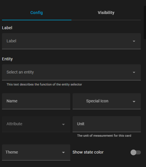
  static getConfigForm() {
    return {
      schema: [
        { name: "label", selector: { label: {} } },
        { name: "entity", required: true, selector: { entity: {} } },
        {
          type: "grid",
          name: "",
          schema: [
            { name: "name", selector: { text: {} } },
            {
              name: "icon",
              selector: {
                icon: {},
              },
              context: {
                icon_entity: "entity",
              },
            },
            {
              name: "attribute",
              selector: {
                attribute: {},
              },
              context: {
                filter_entity: "entity",
              },
            },
            { name: "unit", selector: { text: {} } },
            { name: "theme", selector: { theme: {} } },
            { name: "state_color", selector: { boolean: {} } },
          ],
        },
      ],
      computeLabel: (schema) => {
        if (schema.name === "icon") return "Special Icon";
        return undefined;
      },
      computeHelper: (schema) => {
        switch (schema.name) {
          case "entity":
            return "This text describes the function of the entity selector";
          case "unit":
            return "The unit of measurement for this card";
        }
        return undefined;
      },
      assertConfig: (config) => {
        if (config.other_option) {
          throw new Error("'other_option' is unexpected.");
        }
      },
    };
  }
From this function, you should return an object with up to 4 keys:
schema(required): This is a list of schema objects, one per form field, defining various properties of the field, like the name and selector.computeLabel(optional): This callback function will be called per form field, allowing the card to define the label that will be displayed for the field. Ifundefined, Home Assistant may apply a known translation for generic field names likeentity, or you can supply your own translations.computeHelper(optional): This callback function will be called per form field, allowing you to define longer helper text for the field, which will be displayed below the field.assertConfig(optional): On each update of the configuration, the user's config will be passed to this callback function. If you throw anErrorduring this callback, the visual editor will be disabled. This can be used to disable the visual editor when the user enters incompatible data, like entering an object in yaml for a selector that expects a string. If a subsequent execution of this callback does not throw an error, the visual editor will be re-enabled.
This example then results in the following config form:
Form Schema Elements
The form schema can have individual controls, grids, or expansion panels, configured with the following options:
Controls:
name(required): The name of the control.selector(optional): The selector configuration for this control (see selectors for available options)type(optional): If selector is not defined, there are native form types likefloatandboolean, though using selectors is preferred.
Grids:
type(required):gridname(required): Key for this grid in the form data object (seeflatten)schema(required): A list of child controls in the gridflatten(optional):true/falseif child control data should be flattened into the main data dictionary, or under a sub-dictionary with the name of this gridcolumn_min_width(optional): CSS property for the minimum width of the cells in the grid (for example,200px)
Expansion Panel:
type(required):expandablename(required): Key for this panel in the form data object (seeflatten)schema(required): A list of child controls in the expansion paneltitle(optional): A heading on the panelflatten(optional):true/falseif child control data should be flattened into the main data dictionary, or under a sub-dictionary with the name of this panel
This is not an exhaustive list of all options, more configuration options are listed at ha-form/types.ts